Pantone's Spring/Summer 2021 color forecast highlights the perfect balance of soft and vibrant tones, with standout pastels like floral pink, turquoise, and soft marigold taking center stage. As seasoned interior designers, we've seen how this cheerful palette transforms spaces—here's how to make it work in your home.
1. Bright, Contrasting Color Accents
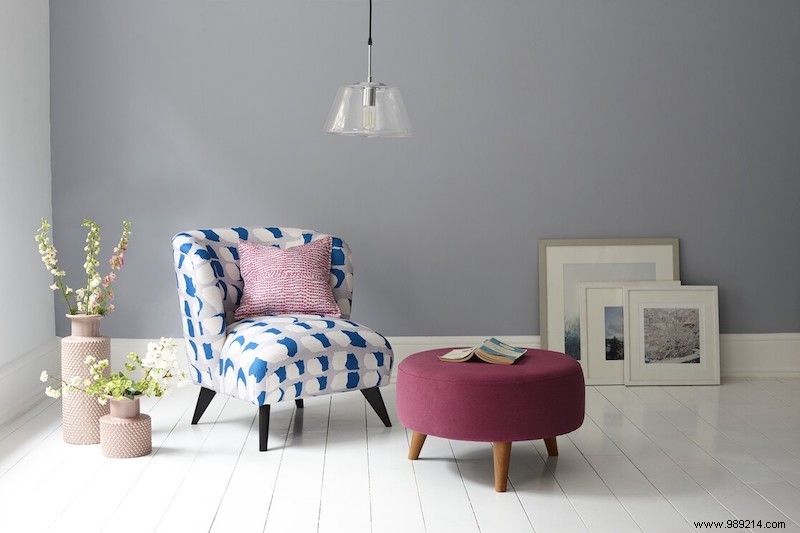
Pantone's Spring 2021 palette draws from nature's floral vibrancy, blending coral and French blue for glamour and warmth against a soothing buttercream base. Introduce these hues through accessories and upholstery for an effortless update.
Start simple with movable pieces like pillows and throws to experiment with combinations. Add art, glassware, or fresh flowers for pops of color. In this room, French blue vases, soft pink walls, and marigold pillows energize a neutral backdrop, delivering freshness and style.
2. Pastel Color Blocking
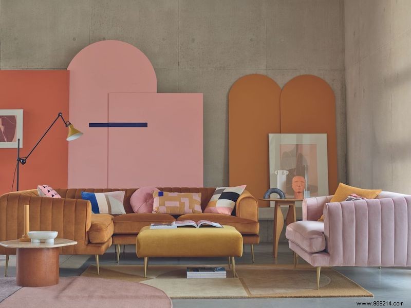
Just as contrast defines chic fashion—think bold lines with soft shades—it elevates interiors too. Pastels shine in color blocking and graphic designs, adding personality without overwhelming.
A color-blocked wall is a bold yet balanced way to feature vibrant pastels. Here, a sunny marigold arch commands attention, softened by pink and cream walls, cerulean pillows, and a deep blue throw for cozy depth.
3. The Ombré Trend with Eye-Catching DIY Furniture
Ombré effects offer an elegant, customizable entry to spring pastels. Try a rewarding DIY: gradient-paint a dresser or chest for a standout focal piece.
This technique intensifies and fades hues like pink simultaneously. Pantone's palette—turquoise, yellow, pink, lavender—provides endless options; layer shades on clean-lined furniture to avoid clutter.
4. Create Impact with Tone-on-Tone Styling
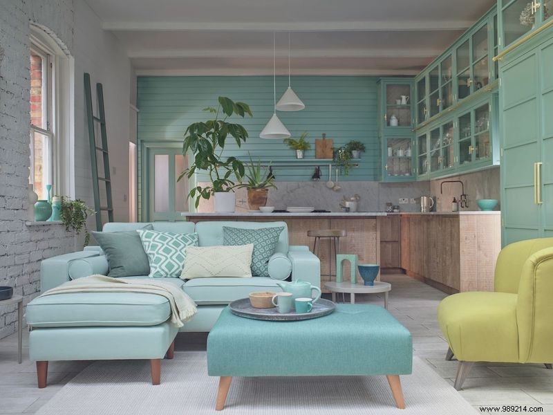
Pastels' gentle nature makes them ideal for tonal schemes, evoking a color's essence like a sophisticated monochromatic look—calm yet characterful.
Airy turquoise suits dining spaces better than bold green. Pair it with a white wooden set for lightness, anchoring with a strong centerpiece. Layer deeper tones via blue pendant lights and glass vases for texture, depth, and intrigue.