From floor coverings to ceilings, color is everywhere in interior design. Harmonizing shades effectively can be challenging but is entirely achievable with the right approach. This expert guide draws on proven principles to help you create balanced, inviting spaces.
Whether decorating a living room, bedroom, or kitchen, selecting colors can quickly become overwhelming, especially with multiple shades. To prevent costly errors and unsightly results, limit yourself to no more than three colors—beyond that, spaces feel cluttered and visually fatiguing.
For striking results, try the monochrome technique: select three shades of the same color and vary tones across walls, doors, windows, baseboards, and woodwork. Always factor in existing elements like upholstery, furniture materials, and styles. A color wheel is an invaluable tool—adjacent colors harmonize seamlessly, while opposites create bold contrast.
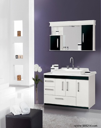
Dubbed the "new black" by interior designers, anthracite gray shines in bathrooms but can feel somber elsewhere. In kitchens, pair it with vibrant accents like apple green to add energy.
Warm and dynamic reds—sanguine, poppy, brick, or carmine—ideal for living rooms and dining areas. Soften with deep tones like chocolate brown, taupe, or natural wood; red also pairs beautifully with other warm hues.
The ultimate relaxation color, blue suits bathrooms in all shades. Today, combine with white, orange, yellow, or naturals. Majorelle or Klein blues with chocolate brown are trending for living rooms, bedrooms, and entryways.
Versatile yellow works in every room: subtle touches with red or orange in kitchens; pink shades for girls' rooms; blue for boys'.