Picture a bright, airy living room flooded with natural light, crisp white walls, and soft taupe accents. This welcoming space gets far more use than a dim, heavy room with stark, muted tones.
Color defines interior design, and taupe—a designer favorite—delivers unmistakable warmth, coziness, and elegance. Professionals have embraced this versatile neutral for its timeless appeal.
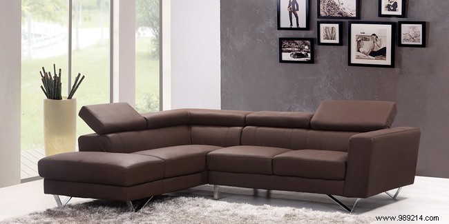
Taupe encompasses a range of soft, warm shades from dark brown to grayish-brown, evoking comfort in any space. The name traces back to the mole (Latin talpa), originally describing the French mole's fur. Like pink and lavender, its meaning expanded in the 1940s to include broader hues.
As a blend of brown and gray, taupe maintains clean pairings without complicating mixes with purples or pinks. Here's why it's reshaping interiors.
Walls are the foundation of your decor. Experts often recommend white to amplify natural light and offer flexibility for furniture and accents.
Bold wall colors can energize a room but risk overwhelming it if overused.
Taupe sits perfectly in between—part of the soothing beige-gray palette, suiting modern or classic styles. As paint or glamorous wallpaper, it infuses warmth, style, and subtle elegance. It diffuses light beautifully, avoiding the sterility of white while adding understated glamour.